Blog 
Preparing for the Big Solo - Part I (below) AND 3-4 Upcoming Exhibition Notices shown here
I have officially finished with this winter today on the completion of Winter In The Meadow 30"x30"(below). The blue greys convey a sense of closed-in cool with the often present winter clouds. Sunrises in winter can be quite spectacular because of these clouds already present just above the horizon. The yellow ochre of the little bluestem grasses have faded now and are quite dishevelled and short compared to early winter when they were bright and standing tall. The little cabin hides in the shadows of the evergreens which provide solid structure in the presence of the leafless deciduous trees.
Winter In The Meadow is the first in a 4 or 6 part series in which I'll play with the colour changes through out the growing season. The series will debut at my solo exhibition a year from now at the Neilson Park Creative Centre in Toronto.
As the show is intended to be a multimedia exhibition with a meadow experience component, I have a lot of work to do as well as a lot to learn regarding the multimedia aspect. The paintings and photographs will come together I think without too much problem. However I'll have two videos that will show as well as the 'experience.'
Drone piloting will be an exciting challenge to learn this spring. I am just waiting for the winds to settle so "Buzz" doesn't end up stuck in a treetop! It is a Spark by DGI which is apparently the manufacturer of choice. Sunday is looking like a good possibility.
I have a notebook going forward with exhibition plans being filled in, divided into categories:
Eligible Paintings, Photos, Resource People , Resource Companies, Equipment needed, Sponsors and Funding, the Catalogue, Printing and Advertising, Calendar Schedule, Gallery dimensions and wall sizes, The Statement Piece (possibilities), Video Processing and Progress, Costs
These pages are filling in. I am waiting for some of the resource people to respond. Are they interested? Spring is always a busy time, especially everything related to plants and the outdoors.
Looking at the Ontario Arts Council granting page brings on long sighs. I have written two successful grant applications for an organization. It was SO much work! Can I do it again? Time will tell.
Yesterday I spoke with a contact about corporate funding. She suggested that I refine my 'ask' into actual ballpark figures and add school groups to the target audience (because she would want her children/teens to see this) She is going to research a few possibilities for me and put me in touch with an additional resource person or two. It was helpful to have this conversation as it further defined for me my intentions going forward e.g. I will want to pay those other artists who are able to help me and I should include this in my funding asks.
I'm hoping that you are interested to follow my journey to a stimulating and exciting solo exhibition. Thanks for reading!
Follow me on  or
or  I’ll let you know when there’s a new post. Or join my contact list here and you'll get an email(not very often)
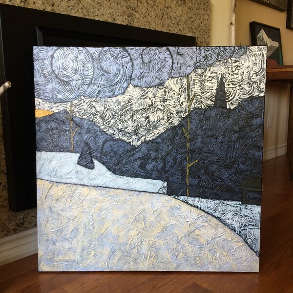
Winter in the Meadow
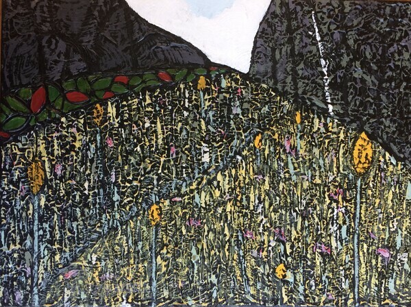
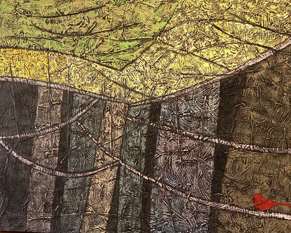
Early September in the Meadow 12"x16" (below) has been hanging in the McMichael Canadian Collection community gallery since January. It is part of a group exhibition by mostly professional artists who painted landscapes for a week in the Pine Cottage at the McMichael in September.
The show is closing this weekend. It is always a thrill to be included in this exhibition!
Now the exhibition will tour making up to 6 stops in various galleries around the province.
This meadow is at the bottom of a forested hill and bordered on the downhill side also by a forest. Berried sumacs fringe the forest beside the brightly blooming meadow. Showy goldenrod (not ordinary Canada goldenrod!) and purple coneflower grace the stage for the last perhaps most stunning performance of the season. Certainly the butterflies and bees think so! ... Painted ladies, Monarchs, Viceroys, Great Spangled Fritillaries, Black Swallowtails, Red Admirals, White Admirals......... :D
Process III- Playing the surprise card
Here I am nearing the end of my play with this commissioned painting. The last thing I usually do is paint my signature ‘surprise’ somewhere.
First an explanation:
In art, colour intensity refers to the level of saturation of colour or the purity of the colour. A pure colour is straight off the colour wheel or rainbow. A colour that is not pure has been altered by adding black, white, gray or another colour. If the colour has been altered minimally, it is referred to as being high key or intense. If altered a lot, the colour would be low key.
The majority of my painting is usually very low key, grayed, colours. This is known as a sophisticated palette. Because I work on a black background, any colour will appear more intense than it would on another base colour. I am continually checking the paint mix against the black as I reduce the intensity. It is always surprising how little pigment is needed while working on black.
Amongst these low key colours, a small area (my surprise) of high key colour will show up like a red flag! The effective power of this small area can be further increased when the colour beside the surprise also contrasts in value(lightness/darkness).
See the painting Near Canmore below and notice how the tiny yellow-green tree carries the weight of the left side of the picture by covering it with your finger. See what it provides to the overall painting? In general, a small area of high power is able to balance a large area of low power. I love using this effect. Feel free to let me know how you see it.
Near Canmore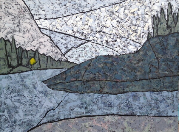
For the current work shown below, there is a brighter patch of mountain flowers on the right foreground corner. I did use the lovely long triangular shape on the opposite bank but this time, it is not quite as ‘surprising’ because it has effectively become part of the more colourful area which includes the wildflower patch and the blue stream.
There are lots of lines on which your gaze can travel to cover the view of the mountain and stream. When you reach the summit, you will notice the beautiful blue sky and the fun I had drawing in the medium underneath. This provides my viewer with another more subtle surprise.
I’m feeling good about my process. Happily, today this was reinforced by a quote on today’s Painter’s Keys newsletter:
“In degree, it’s the calculated addition of visual surprise and incongruity that makes works of art speak both to the artist and her people.”
Follow me on instagram @CherylBaileyArts  or FB
or FB  I’ll let you know when there’s a new post. Thanks for reading!
Rocky Mountain River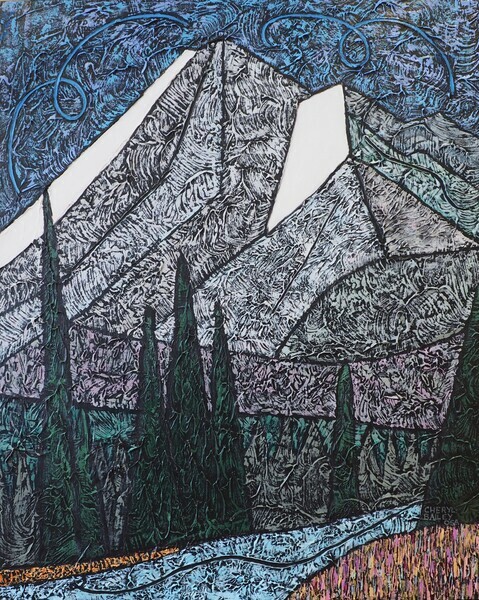
Process II-Every Artist has some sort of process
You may remember that the last blog entry was about how my process starts: getting the pencil sketch ready. This stage is often the longest. I like to have my composition set before I start to paint. This is because the presence, here and there, of the black underpainting is important and I don’t want to end up obliterating it .
When I have a sketch ready, I transfer the design to the black textured surface. Even though my compositions are made up of simple shapes, since I have worked so carefully on the sketch, I use a high/low combo of technology to transfer my sketch accurately to the canvas: chalk and a projector.
Black is the darkest dark. Anything else looks lighter and brighter beside it and so I will use a lot less intensity in my palette than many artists. This is so my work doesn’t look like a black velvet painting from the 1960s!
I can start painting in any shape. Just decide. And decide on a colour. Within the groupings of ‘shapes’ on the sketch, I can play with all sorts of colours of similar value (lightness or darkness). Matching values between colours is a very useful and important skill for an artist.
To maintain and emphasize the shapes (both negative and positive shapes) within the composition, I actually leave a black “outline.“
Sometimes, not often, the work calls for a midway redo or rethink of a few shapes. It’s more usual to progress working through my shapes until it’s time to step back and make a grand evaluation before the fun finale. I’ll leave that for next time.
Follow me on instagram @CherylBaileyArts or FB I’ll let you know when there’s a new post. Thanks for reading!
Every artist has some sort of process. Some may be more methodical than others. I remember when I began to have success with using textures in my work. I wasn't just quite sure how that had happened as the paintings evolved. At one point I actually wrote down what I had done so that I could see what the result was in comparison to another result. In time, I developed a set 'process' (with some variation). This is now very helpful as I don't have to start from scratch for each painting. Something like doing a series, several aspects of the preparation are held constant so that creativity can pour into the rest of the work.
Having a process makes it easier for me to start a work.Pencil on paper is not a really big commitment compared to paint on canvas. I sketch in my wee Moleskine book or the 8x10 depending on where I am. Sometimes the sketch is out of my head. More often, its starts from one of my many photographs that I have digitally altered to black/gray/white.
The sketch develops in several drawn frames. Usually there is a lot of erasing involved. I use a soft pencil which is easy to erase but it wears down quickly. If I am sketching and the sharpener isn't nearby , oh well, it can all be quite blurry as below. In a way this is a good thing as I can't get into details.
The small sketches are used in a traditional way to find/experiment with where the lights and darks and middles will be. I like to have a good value structure before I begin. A strong value change provides the most impact or power in a painting. We look to the places where the lightest light meets the darkest dark. I like to gather the lights, gather the darks, gather the middles so the painting has strong structure.
By this time, since I have been working in achromatic, I am farther away in thought from the actual colours of any photograph I may have used to begin. This is helpful in opening up possibilities.
When I am happy with the sketch, I transfer the sketch to my prepared canvas. Maybe I'll write about that next time?
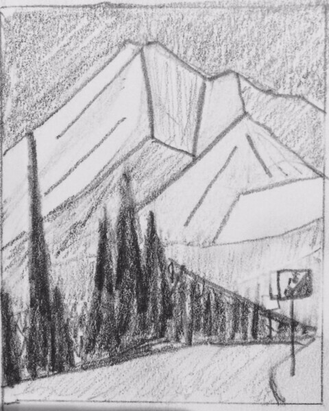
Here's the latest sketch for a commission I am working on:
Follow me on instagram @CherylBaileyArts or FB I’ll let you know when there’s a new post. Thanks for reading!
Mountain Road
Freedom and Rules
The freedom available to me in the art of painting is one of Art’s main attractions. We learn how the tools work and use them in any way we choose. Despite what some art instructors teach, there are in fact no rules when we know how to break the rules successfully. It just has to work.
For example , some say don’t put your main interest in the dead centre of the canvas. This is because when all of the power is in the middle of the painting, the painting will suffer from what is called “the tyranny of the centre,” a phrase coined by Rembrandt. In fact, you can choose to put the largest amount of power in the centre, as long as you provide a way for the viewer to move their gaze away from the centre. Put a little power elsewhere in the painting to draw the eye. Simple.
Some have a rule ‘don’t use black.’ As the darkest dark, black is in fact extremely useful. My current work begins on an unusual textured black surface. Because the texture reflects light in many directions, it is tricky to photograph accurately but also the black becomes visually varied. Black provides the ultimate contrast in colour relationships. Any colour is lighter and brighter than black. That is a very useful tool. Black works for me. To make it work, I am careful with my colour intensities, using it sparingly, so that the painting is not screaming at the viewer like a painting on black velvet.
There is also a rule of thirds to create a perfect balance. If you put the focal points on the crossing lines of where the length and width of the painting is divided into thirds, you will certainly get a balanced work. But what is so interesting about a perfect balance? Risk taking is part of art. Great art can teeter on the edge of being balanced. We can push the envelope as long as it works.
Abstracting landscapes provides a nice sense of satisfaction for me. I love our Canadian landscape. I have always taken photographs of landscape. In abstracting my landscapes, I get to play with the colours and shapes of landscapes in whatever way I choose, sometimes using more abstraction, sometimes less. It’s all up to me, as long as I can make it work.
We have the freedom to make the art we choose.Be Fearless. The magic happens when we are out of our comfort zone.
Here is a little still life that I completed a few weeks ago:
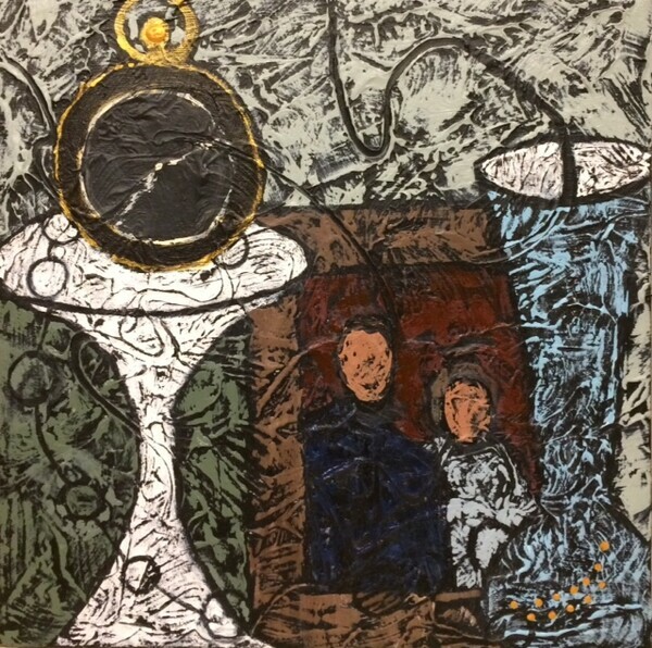
Time 12"x12"
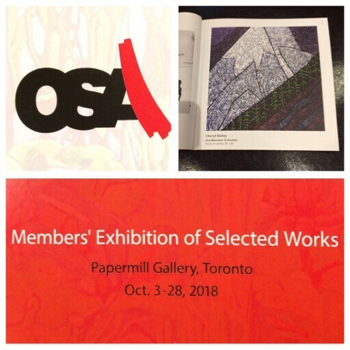
I wanted to share news with you about the 3 exhibitions that are happening this month around Ontario. Please click here to see the details about these current exhibitions at Headwaters Arts Gallery in Caledon, Neilson Park Creative Centre and Papermill Gallery in Toronto.
Yesterday I accepted an offer of showing with a small group of Ontario Society of Artists members which includes several past presidents of the society. City of Toronto's Assembly Hall gallery will host "Expressions of Landscape" from January 17-February 14th. The Opening Reception will be on Thursday January 17th 7-9 pm. You are most welcome!
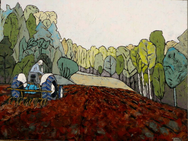
Decisions remain as to which pieces I will exhibit in the Expressions of Landscape show. I am thinking of several mountains and perhaps our meadow. I was looking at an early work of the meadow (below) while it was under cultivation for the native planting. Possibly an updated painting of this same view, 6 years later?
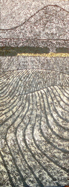
Lately I have been playing with elongated canvases both horizontal (see above) and vertical. Today I was painting a vertical slice of the mountain at Kicking Horse Pass. This was suggested by a larger view showing the Spiral (train) Tunnels. I'll save this one for the January show at the Assembly Hall. As always, I welcome your comments and would be pleased to hear that you took in one or two of the shows. Cheers!
En Plein Air painting has made a comeback. The Impressionists were really into painting on location but although there have been plein air painters since paint was put into tubes, the styles of painting that developed mid 20th century led many back to studio painting. Summer is short and it is great to be out painting while enjoying the fresh warm air.
When I first started painting, I did try painting a view while looking at the view. I think they were successful paintings but not my style. Later on I found out what it was that was unsatisfactory about plein air painting for me.
It was no trouble getting the equipment in place or working outside. Our mentor verbalized the problem saying it was that the freedom of painting, was diminished. This explained it: I felt compelled to paint what I saw. This would include the colours and placing more emphasis on detail. Maybe it over-stimulated my left brain? But I still wanted to work outdoors.
I do know one woman who can look at a view and come up with something else entirely in terms of colours.
My solution--I decided that I would take my stuff down to the meadow and just work on what was on the easel at the moment. A very large canvas might be trouble, catching the wind and blowing over.
The Group of Seven painted on easy-to-travel 12x16" panels while on location. They used oil paints so work was then transported while still wet. Tricky. These are know as sketches that were then used to compose their large paintings. Incidentally, I just spoke to a woman whose family had bought one of these small paintings from AJ Casson before he died. They sold it for a ton of cash more recently!
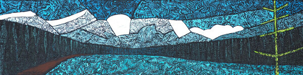
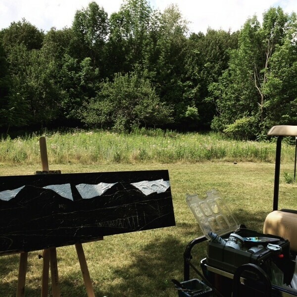
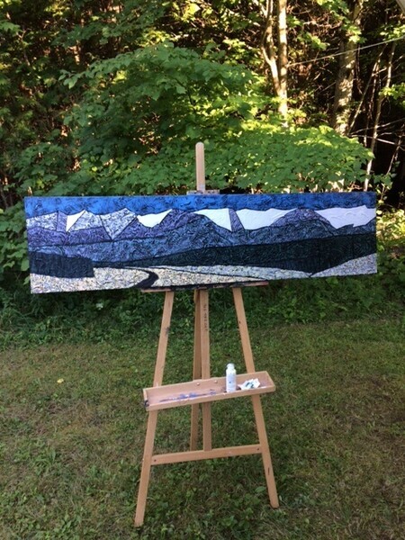
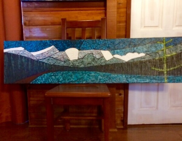
This weekend, I was working on 2 long narrow canvases of Rocky Mountain ranges. The meadow was calm, I took a position in the shade, and had a very fine day keeping company with the buzzing bees and busy butterflies.
Here's the progress I made. Not done but definitely coming along nicely. You can see that I have set up my paints and water on the back of the 4 seat golf cart. Works for me!
A new string of exhibition entry deadlines are quickly advancing toward me on the calendar. I missed one last week— couldn’t be helped. But next week is another and the week after a third one. A good bio will show participation in juried exhibitions each year. It shows you are an active and serious artist.
There is a size restriction to 30” wide max next week. Unusual. The Headwaters Juried Art Show is a main fundraiser for the artist run gallery. I rather think that because so many of the works last year were very large and consequently expensive that not many sold and not much fundraising resulted. I usually paint in larger (but not huge) formats. 30 inch wide is near the starting width for the larger pieces. Everything else is a lot smaller. I find it as much work to do a small piece as to do a large piece. Consequently, I would rather go bigger. My contenders for this exhibition suddenly became fewer.
There are non-refundable entry fees to each show that the artists must pay. A slight discount is available to members of the exhibition gallery. These fees pay for the gallery rental, repainting/repairing holes, reception costs, rack cards, advertising, jurors fees etc. If your work is not accepted, you can think of the fee as a donation, helping the local arts.
Most exhibitions are now entered digitally. This saves the artist shlepping the work to the venue and right back home if it is not selected for the show. This also allows artists at a further distance to enter the show as they (or their work) don’t have to travel unless their work does get selected.
I always find it hard to choose which painting(s) I will enter into a given show. A large painting presumably must warrant a large amount of wall space in the jurors judgment. But a larger painting implies the artist is serious as well. Jurors differ widely in what is selected. Usually there are 2 or 3 jurors per exhibition. One juror may love a piece and another juror for the same show not so much. So the jurors make deals with each. “if you want that one in then I want this one in.” A particular painting may be unselected for a particular exhibition and in another it wins a prize. Go figure! There is no definitive accounting for the decisions. Some jurors are very experienced, or it maybe their first time in the position. Some jurors can’t help curating a show when they are meant to be selecting the best work regardless of how it all hangs together.
So for the Headwaters exhibition, I think I will enter Cardinal Under Cover, Tethered, and In The Hills. One, two , three or none may get into the show. So today, I’ll be photographing, resizing photos, checking labelling, touching up. There’s a lot of admin work involved in being a practicing professional artist. Phew!
Tethered 20x20
Cardinal Under Cover 24x30
In the Hills 18x48
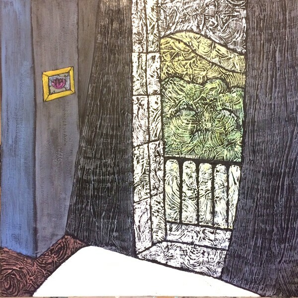
For our anniversary one year, we went to France to see Monet's garden. I have been an avid gardener since we bought our first home. The fact that Monet was a gardener and also a painter was quite inspiring to me as my interest in Art began to grow.
We stayed in a bed and breakfast in a home that was there in Monet's day. In fact, the breakfast bar was said to be converted from an afternoon 'bar' where Monet would visit. It is just down the road a few blocks. Our room was beautifully light and airy with peachy pink walls and wispy sheers.
Now what would I do with that?
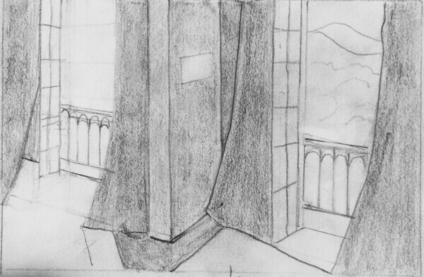
I have a short series at present with landscapes as seen through windows and doors. Matisse did paintings like this, using the device of a window or door. Our room had french windows that opened out onto a narrow balcony just wide enough for a bistro table. The railing was over grown with vines and we looked out over a dense area of bamboo toward one of the hills backing up Giverny.
So I made the value sketch simplified the composition and decided on a large light area in the door area down through the room and the bed shapes and strong darks surrounding the windows and some medium dark areas at the floor. It was difficult to get away from the light airy sheers idea until I got it into my head that they are all just shapes to play with.
It would be an evening picture so the walls and sheers could be darker. Remember dark is a relative description. Dark areas contrasting with light areas make a more powerful image.
I put a small painting (my style:) of a water lily on the dark wall with a light but bright yellow frame. This makes is a focal point to draw the eye away from the light window with the high value contrast dark curtains on either side.
The landscape area outside is analogous cools. There are very light warms in the window panes and the rest is blue/orange low intensity contrasts.
There's a large one in progress-- my largest work yet- 40"x60" - don't think my car will hold a bigger one. It will have 2 windows. Hoping for another good one! Here is the sketch for the next work and the one completed smaller work.
sketch of larger painting
Gentle Breeze 30x30"
Comments welcome. Have a great weekend!