Blog 
Recently I was asked how I chose my paint colours. This is a fun question because there are so many ways to look at colour. The first bit is an intro to colour theory and terms. Then below is what I do.
Quick intro on colour theory to start:
A particular colour will have 3 qualities
1. hue
2. value
3. intensity (also called saturation)
There are 3 primary colours(red, blue, yellow), 3 secondary colours (violet, green, orange all made by mixing 2 primaries) and almost an infinite number of tertiary colours(made by mixing a combination of all 3 primaries in varying amounts). (There are 2 schools of thought on the use of the term “tertiary.” This is how we use it.)
Between the primary hues on the colour wheel, there is a range for each primary. For eg for red , it can be an red orange , or a red red orange or a red violet. For blue, there is blue-green, blue-blue green and blue-violet. These are also called tertiary because they have all 3 primaries.
Within intensity, a colour can be a very light red (with a lot of white-a pink) through to a pure red and on to a dark red (with a lot of black). This is tinting (adding white) and shading (adding black). You can also add grays of all different values which is called toning.
The intensity or saturation of a colour can also be reduced by adding another colour. This can result in the rich earthy colours or just mud. ( I guess mud is earthy)
The value of a colour refers to the lightness or darkness of a colour. A scale of 1 to 10 is used to describe this from black to dark greys through light grays and to white. Many artists use a gray scale card. This is a card with the 10 values from black through grays to white. If you put a paint colour next to your gray scale card and squint your eyes, the impact of the colour will lessen and you can see what value on the gray scale matches this particular colour is.
Here’s what I do:
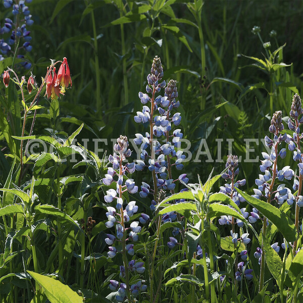
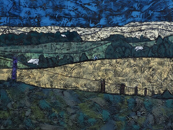
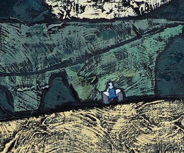
I’m a bit of a matchmaker ;) because I like to rather closely match the values of the colours in a shape so that the shape appears flat. If I also closely match values in a group of shapes, I create a larger visual shape. This ultimately results in a “value structure” of lights, middles and darks in the painting which lends calm and avoids a busy-ness in the work For example:
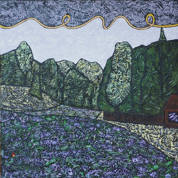
Lupins!
Busy-ness in the work is caused by a lot of light areas being mixed with a lot of dark areas. Not my style.
Sometimes I’ve decided on a colour scheme such as complementary (opposites) or analogous(colours beside each other) or monochromatic (just one colour) and stick to it. Other times I start there and then veer off to include other colours as well. Almost always I’ll have a blue since I love blue so much. A red is also very useful for moving the viewer’s eye around because we can’t not look at a red. This quality is called psychoactivity.
Over the winter, I lashed out and bought the Color-aid box (paint chips for artists) so I could just look/see/choose.

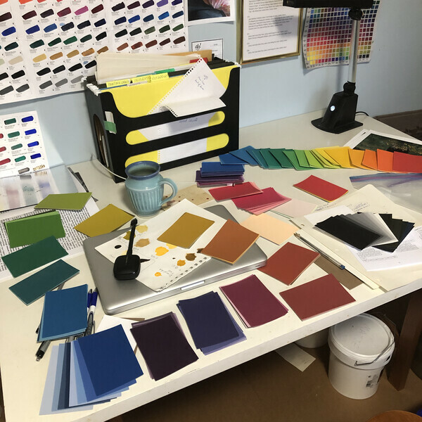
Artists are trained to reproduce any colour. If I am shopping in my new box of colours, I can hold the card up on my black background, decide it is right and go mix. If I need to mix up more of the same colour later in the work, I am able to do so.
I need less intensity when painting on black because black, the ultimate dark, contrasts so strongly that the other colours can glow. This can be wonderful but, if overused, a cartoonish feel can be created. I’ll mix up a green and have to keep desaturating it until it hardly looks green on the palette, but is definitely green on the black canvas.
I almost never use a pure colour except (and there are always exceptions aren’t there?) when I decide near the end where I want a compositional element. So, really, I lied! I always use a pure (or just very intense) colour once on each painting to create a compositional element to draw your eye. This is because a pure colour beside a desaturated colour is a one of the contrasts that creates elemental power in the work. Take a look at my work and you will almost always see it.
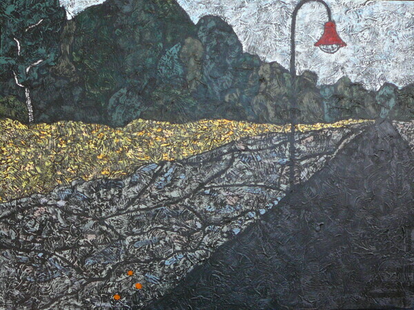
Evening in Giverny
I am currently in week 9 of the Creative Visionary Program. I was reminded of the use of chromatic light in creating colour harmony in a painting. This is when one colour is added to all the other colours on the palette or when a colour is glazed over the entire painting towards the end.
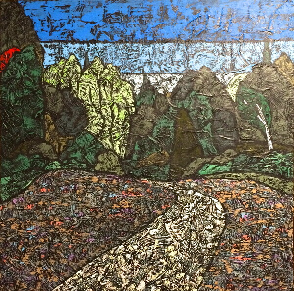
Evening Meadow
One of my paintings where I used these (tertiary) colours to good effect is in the meadow of “Evening Meadow.” The tertiary colours are sometimes called “rich.” Because there’s something special about a grey with a blush of colour, colours desaturated by using greys are called “sophisticated.”
I have to say at this point that my work in the past has been more “sophisticated” than “rich”! Let’s see what happens now?
“CAMH Gifts of Light is a 100% donation-funded program that works with patients, families, and clinical staff to support areas that do not receive ministry funding. With your support, we can continue to help over 14,000 patients a year find the hope, strength, and courage they need to get through their hardest days and find a better tomorrow”
The patients at CAMH are in the most dire situations of human suffering assuredly made worse by the pandemic.
I've decided to find new homes for the photographs that were to be part of my solo exhibition(cancelled for Covid). When you purchase one of these stunningly mounted exhibition quality ready to gift and hang photos, 50(if shipped) to 70(if picked up) dollars will be donated to the Gifts of Light program.
Thanks so much for your help as we continue on in our journey to get past the Covid-19 pandemic. Here's the link:
All the best,
Cheryl
Have I ever spent such a long time preparing for visitors?!! The answer would be a resounding “No!!”
Well, now we’re all ready for your visit! CherylBailey.ca has a fresh new look to coincide with the arrival of E-commerce.
Shopify, a highly rated Canadian company, will facilitate artwork purchase on our website. Of course you can also contact me to arrange to see paintings in person or a home trial.
The ShopHERE program for artists, sponsored by several levels of government and a number of large corporations, helped me set up the e-commerce on my website. We extend hearty thanks to the ShopHERE program.
The artworks have been loaded into the shop. They have been organized into 4 collections as shown on the website menu:
- High Views (mountains and long views)
- Meadows
- Smalls (small paintings)
- Eclectic(France and various others)
There is of course some overlapping. Most of the artworks have been loaded. Please enquire if you are interested in something in the Available Works gallery that is not yet in the shop. Paintings of the same size are the same price.
Art Gallery Burlington’s “AGB Shop” and Dragonfly Arts on Broadway (in beautiful historic downtown Orangeville) continue to carry my work.
If you enjoy my art, please spread the word. THANKS!
Time Out 12”x12”
What is your mid summer nights dream?
My dream is one wherein the world has blown past the anxiety of pandemic days and heat waves, nights are cool, days are summery warm and there is enough rain each week so that all birds, bees and butterflies have lots of juicy flowers and bugs on which to sip and nibble. And I can hug whoever I like.
Outdoors is as always a great place to spend your time these days or any day! Take a hike, a walk in the park or go for a drive in the countryside. Breathe! Healthy and safe.
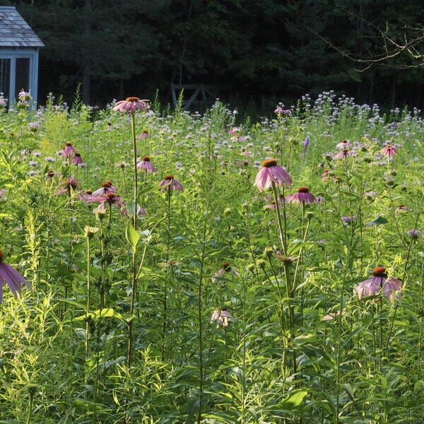
The seeded perennial meadow is in full bloom. Pale coneflower(long, lanky and limp) is finishing and sturdier regular echinacea is taking centre stage complimented by varying shades of billowing pale purple bergamot. The tall spikes of blazing star are unfurling into blue-violet fuzzy spires and there are even more than last year. Here and there are vervain, fading butterfly weed. The spires of special showy goldenrod are reaching for the puffy clouds, in preparation for their stunning debut in September.
We’ve seen white admirals, monarchs, wood nymphs, hummingbird moths, red admirals, fritillaries, crescents, mourning cloaks, and black swallowtails and tiger swallowtails. I hope I can add to my list of over 20 butterflies this season.
You will see in my paintings and posts that I love to spend time in peaceful meadows and energizing mountains. And then I go into the studio to choreograph these beautiful landscapes into original unique artworks.
How do you feel when you breathe in Canadian landscape?
Bergamot Haze 30"x30" in the Meadows Collection of our new gallery shop.
April 1, 2020
It feels like a cruel April Fools joke but today I finally got the long awaited but expected official cancellation of The Meadow Project: If You Plant It They Will Come due to the COVID-19 pandemic. I would be lying if I didn’t confess my immense disappointment in the unfolding of events with respect in particular to my exhibition. I take my consolation in the recent event of my work “Joy Riding” becoming a part of Ontario’s cultural history.” To have work in a public collection is a good size line in an artist’s bio😊.
News of the exhibition being rescheduled will be posted at a later time. I am free to create again. Yippee, sort of!
I hope all my family and friends and art lovers like you will guard your health as the precious jewel that it is. God bless.
Cheryl
It was a particular joy for me to check my email this morning and find that my painting "Joy Riding" has been juried and selected by the Curators at the Archives of Ontario. The Ontario Society of Artists(OSA) has a long relationship with the Ontario Government and is the longest continually operating art society in Canada-- since 1872. In fact we are coming up for our 150th anniversary in 2022 and we will celebrate. Special exhibitions and a book and video are currently in the works.
Last summer, members of the OSA were invited by Archives of Ontario to submit work (particularly on a landscape theme) to be considered for inclusion in the Government of Ontario Art Collection. The work was submitted by early October and the news has finally come out. The last time this invitation was extended was 15 years ago. Needless to say I am greatly chuffed to receive my acceptance. What a thrill in these beleaguered days of social distancing and self isolation for so many.
At this point, there is an exhibition at Queen's Park planned for the paintings going to the Archives. Cool!
Joy Riding 30"x40" A favourite view on the 5th in Dufferin County west of Mansfield. That's Old Dex, the 1963 Ford Super Dexta tractor, trundling over the hills.
 detail
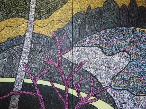
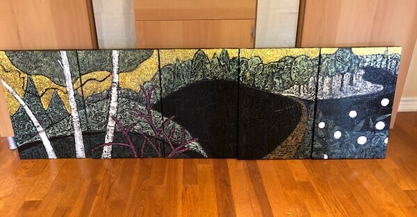
The huge polyptych for my solo exhibition is done! It is 200 inches wide by 60 inches high. I'm painting the 83 feet of edges now and getting the wiring and labelling started. Two of the middle panels of the painting will be the picture for a exhibition rack card. Lots of info is provided on the back of the rack card to get you excited about the exhibition. I ordered the cards today :D
Here is a pic of two of the middle panels:
Even after having made a mini version of this large work, there were a few do-overs. When I am not impressed with a shape, I generally have to go back and repaint the black underpainting. It's important that the black be clean. Of course, black is the darkest dark and sets off all other colours, even dull ones because of the relative intensity of the colours to the zero intensity black.
I find painting the light areas the most tricky because of leaving the black intact OR having a light even dry brushing to exclude more of the black. I did the light part of the meadow and then I painted the shadowed part of the meadow. I liked the latter so much better that I decided a do-over of the lighter area was needed.
To keep the work, of basically copying myself, interesting, aside from hefting these large panels around regularly, I did make a few changes from the mini mock ups. See if you can notice any of the changes in the two panels shown above. Here are the mini-bigs:
Really my studio is too small to attempt this size of work but it has been an exciting project. I've borrowed extra easels to line up three of the five panels at a time. Some of the shapes stretch over three panels and I wanted each shape painted all at once.
There is still so much else yet to do!
Next week I will return to the video editing which has been waiting in final stages since end of November. The installation set ups plans for the videos are being worked on. More on that later.
Have you marked the show on your calendar? April 21-May 9 with Opening Reception on Sat April 25 from 1-4 pm.
You can click on the link below to see the latest newsletter with Ontario Arts Council news.
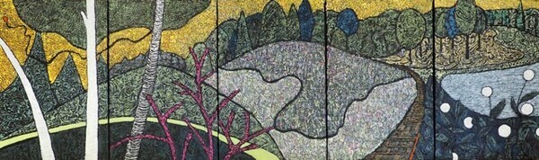
The solo exhibition scheduled for April 20-May 10 2020 will exhibit a large polyptych on the impact wall, the wall that is seen on entering the gallery. It will be 5 canvases 40x60 for a total of 16.7 feet width. The 40x60 inch canvas is the largest canvas that my car will carry. My plan is that each of the canvases are a standalone painting and that may be hung individually or in groups with one, two or three or four neighbours.
To this end, I have worked up a sketch of the planned work:
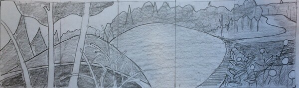
In order to avoid too many do-overs, I am painting some minibigs of the work to solve any problems that may come up in a smaller scale. The canvases are 16x24(relatively small), same proportions, but still ending up 6 feet wide! Here's where I am so far:
As you can see, there are still black areas to paint. The white buttonbush flowerhead are place holders - think I will add a bit more texture to those so they're not pure white. When I get the basic painting done in all areas, I'll add the juicy focal points as necessary in my signature way so that each canvas will be a complete painting.
This is an exciting project for me as it will be my largest and most complex- each picture being standalone as well as part of a whole. You may recognize several motifs that I have used before in some of my favourite works. I welcome your feedback!
You may have noticed that I haven’t been posting painted work lately. Well it’s summer and I’ve been flying! Flying Miss Sparky, that is. As part of my solo exhibition, If You Plant It, They Will Come(working title) next spring, there will be a video of a butterfly’s view of the meadow as the blooms progresses from early lupins to the spectacular show in September.
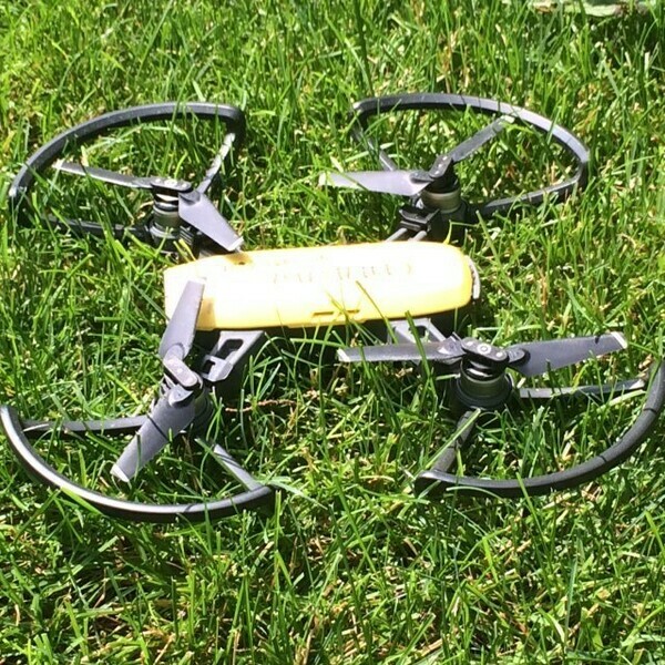

Miss Sparky and closeup of the gimbal-mounted camera
After waiting anxiously for several years through drought and heat for the plants to mature, I am now obsessed with my meadow in the summer months. The meadow sits between the uphill mainly evergreen forest and the lowland deciduous forest.
This year,with the large amount of snow melting and then flash freezing in Feb, we had a great deal of melt water run from the uphill forest carrying a truckload(literally!) of sand down into our beautiful meadow. Desperate measures were taken to avoid the plants being drowned in 8-10 inches of beautiful fine pale sand that settled as the water ran further towards the river. An unusual problem. We dug with shovels, raked and then scraped down to the soil level with the tractor as much as possible but we are still left with great swaths of beautiful sand covering paths and parts of the planted areas. Let me know if you need sand for your sandbox -- Really!
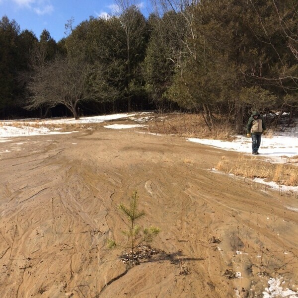
the sand coming from the uphill forest in april
In most of the sanded parts of the planted meadow, most of the plants have pushed through the sand. Some spots look bare. It can’t be helped. On the plus side, I see many volunteers sprouting up from lupin seeds which are totally recognizable based on leaf shape.
In Canada, as of June 1 2019, a pilot licence is necessary to fly a drone over 250grams. Miss Sparky weighs in at 300g so I had to learn quite a lot of material to be licensed quickly in order to get flights in before the first bloom faded.
Flying a drone isn’t as easy as I imagined. For several weeks I flew with the iPad as the controller: fingers sliding on the glass giving incorrect direction and frustration. I finally gave in and bought an actual remote controller complete with two little joysticks. One controls forward/backward and horizontal rotation. The other controls elevation and turning right/left. WAY EASIER than the iPad, still not easy, but happily making progress.
When the drone is flying, time also flies with only 12 minutes of battery life. Landing safely on my flat landing stone without too much rush is important so that the delicate quadricopter propellers don’t end up becoming inadvertent plant trimming clippers in the middle of the meadow. My digital co-pilot’s recorded voice relays a curt message “Battery low, landing in 10 seconds.” then “Landing.” And Miss Sparky lands wherever she is.
Until next time!
Cheryl
p.s. oops to those of you who subscribe, I forgot to send the last post to you. You can still see it on the website :D
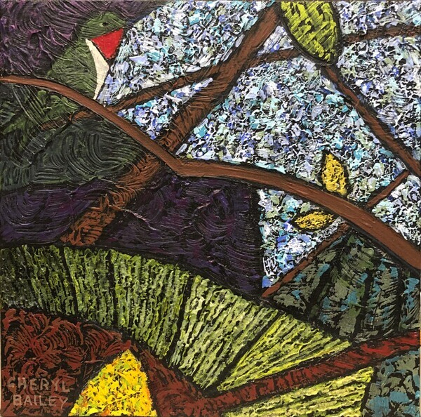
I’ve made progress on the 4 part series where I play with the colour changes through out the growing season. I used the same composition, but provided some variation in the values(lightness/darkess) of the different shapes that make up the composition.
In the previous post, I wrote about the very light snowy scene Winter in the Meadow.
The next painting, Lupins!, is basically the same composition but showing May when the lupins bloom. The meadow has been filled in with rich medium dark green plant leaves. The native lupins are a medium dark blue-violet. In the actual meadow it is a subtle scene because of the lack of light/dark contrast between the flowers and the leaves. This becomes easy to convey in the meadow shape as green and violet are both easily to darkened yet retain enough colour intensity.
The first meadow blooms are a thrill, hence the the cheeriness in the sky. Hurray Spring!
(At the moment, I am planning on just the 4 in the series, but I could easily include another for June with the sunny and raucous coreopsis.)
Then the Bergamot Haze of July follows showing the cloud of pale red violet. Bergamot is airy with finger-like petals curving gracefully upwards presenting the soft haze over the meadow. The first few years after seeding the meadow were droughts. But without any watering the Bergamot never failed to bloom. Such a delicate colour for such a tough plant.
Are those stylized wisps of cloud or jet trails in the sky? You can decide. They were fun for me. Depending on the work, I will think of the sky as a big playground for using the art tools. There are 16 items on my list to choose from when something is needed - the 'je ne sai quoi' moment. But more on that another time.
Lazy hazy days of Summer (sigh!). Can't wait.
Lupins!
Bergamot Haze